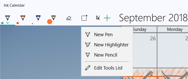
Adding a pen gallery was simple at first but I decided to add some more to the custom tool button. In my initial attempt I would initialize a new InktoolbarCustomPenButton and set its properties in code then add it to the Inktoolbar.
While this did work it left the issue of having two pens of the same type and color but different size and not being able to differentiate between them. So I decided to make a custom XAML control for custom pens, custom highlighters, and custom pens.
I started with a user control, but then just made a custom control of type InkToolbarCustomPenButton. I could customize the content of each of these controls to match the default inktoolbar buttons. To find these symbols I used the awesome app Character Map UWP by Edi Wang (Store Link HERE). I needed the tool outline, the tip and top color, and the background fill.
I bound the fill of the tip and top color to the SelectedBrush property of the InkToolbarCustomPenButton. Then I bound the background fill to the background of the InkToolbarCustomPenButton. This is so when the size shape is big enough it won’t make the tool icon look transparent.

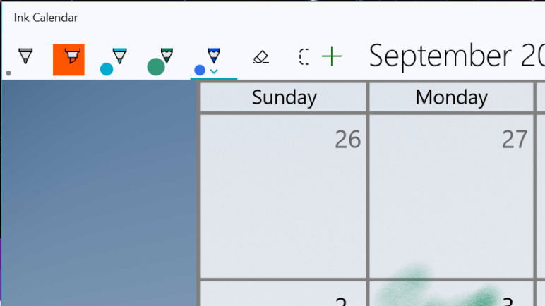
For the size representation, pen and pencil use an ellipse and highlighter uses a rectangle which the fill is bound to the SelectedBrush property and the height and width both bound to SelectedStrokeWidth. With oneway binding the shape would change color and size as the user adjusted the pen options.
Now when the users clicks “New Pen” an instance of my custom control is created and added to the inktoolbar. Simple. Users could add as many pens as they wish. They are in a scrollviewer so they can all be seen with a quick flick.
Next is the challenge of saving and loading this custom gallery each time the app loads.
Joe
 Ink Calendar and Journal